


Color grading — also known as split toning — is a great way to give your photographs a unique and stylized look, adding a hint of color that can create a certain mood or draw on photography’s rich history to bring out a vintage feel.
If you’ve ever asked yourself, “How do I get earthy tones or golden skin tones in Lightroom?”, this guide will give you the perfect platform from which to start.
Split toning and color grading are possible in most editing software, but this guide will concentrate on how it can be achieved in Adobe Lightroom Classic and Adobe Lightroom CC.
Popular course reveals the simple tricks to getting incredible results with Lightroom in record time. Give Your Photos The Look They Deserve!
![]()
Table of Contents
What is Split Toning in Lightroom?
Split toning or color grading in Lightroom is a means of adding hints of color to the shadows or highlights of an image. In the latest version of Lightroom, you can now also bring color into the midtones, as well as the image as a whole.
Color grading is similar to changing the white balance of a photo, but you have much greater control and the results can be far more subtle and stylized.
While you typically set your white balance as you start editing your image, split toning and color grading is usually one of the last steps, giving a photograph a finishing touch.
The technique comes from photography’s history, drawing on chemical processes while developing film that would sometimes cause a slight, often unintentional shift in the color of an image.
The term split toning comes from the idea that you would add one color to the shadows, and another color to the highlights, effectively “splitting” the tones of the photograph.
With digital editing, split toning and color grading has become a method of adding drama or emotion to a photograph and can be used to create a personal style.
It’s also more sophisticated digitally: previously limited to shadows and highlights, Lightroom allows you to introduce colors into the midtones, and also as a global effect.
Lastly, split toning is a perfect way to add a sepia filter to your black and white images, allowing you to introduce a suggestion of color and give a subtle shift of mood to your monochrome photographs.
Split Toning Panel Options
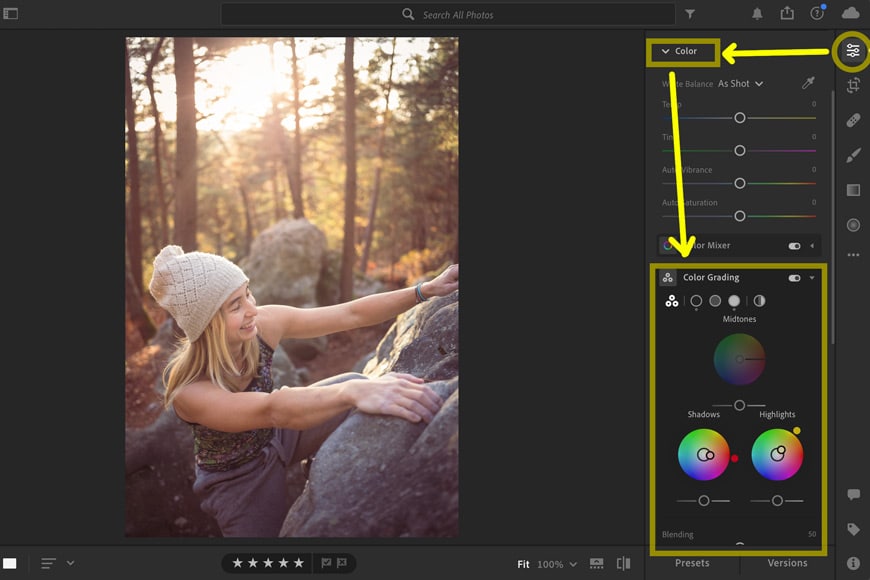
Split toning in Lightroom now falls under the Color Grading panel.
In 2020, Lightroom transformed how it edits split tones, changing the panel completely.
Instead of “Split Toning,” the panel in the Develop module is now called Color Grading and includes a lot more control and functionality.
The Color Grading panel can appear confusing at first, largely because a lot of the controls are replicated. Once you understand where Lightroom has doubled up (or tripled up!) on how certain elements can be changed, it becomes a lot easier to understand.
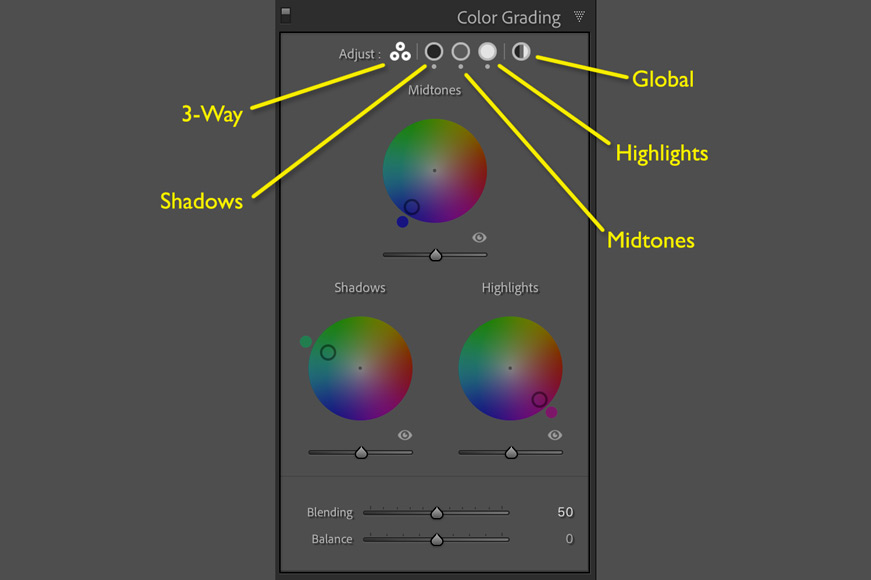
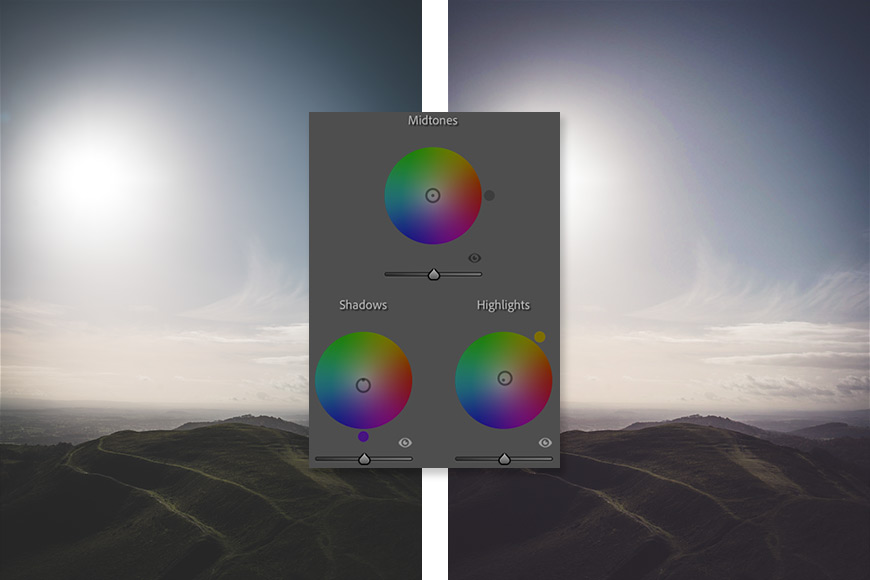
Lightroom gives you three color wheels to control for introducing color: Shadows, Midtones, and Highlights. The default view is “3-Way” — i.e., showing small versions of all three color wheels.
You can see a larger version of individual color wheels by clicking on the various icons next to the word “Adjust” at the top of the panel.
The individual views give you close control over each split toning adjustment, while the 3-Way view allows you to see how all of your chosen colors relate to one another.
There’s also a Global wheel which we’ll come back to later.
Two Handles for Each Wheel

Each wheel has two handles: one in the center and one at the edge.
Drag the center handle to choose a color, or just click somewhere on the color wheel. The further away the handle is from the center, the higher the saturation. (You might also notice a hue slider and saturation slider underneath – we’ll talk about these in their own section below.)
To change Saturation without having to worry about changing the hue, drag the center handle while holding Shift. To change only the hue, drag the handle while holding Control (Windows) or Command (macOS).
In addition, the handle at the edge of the circle allows you to finetune your choice of hue.
As you move the handles, you will notice that the two numbers — Hue and Sat — change accordingly. If you prefer, you can type in your own values to set the hue and saturation.
To the bottom right of each wheel is an eye. Click and hold to hide the changes you’re making in order to give yourself a quick comparison.
Swatch and Color Grabber

A colored square sits to the bottom left of the color grading wheel. Click on it to reveal a swatch.
If you right-click on one of the five swatches, you can choose to save your current hue/saturation selection so that you can come back to it later.
You can choose any color on your screen if you click and drag the eye-dropper, releasing the mouse when you’re over your desired pixels. This can be useful for grabbing a color from different software outside of Lightroom.
Hue, Saturation, Luminance Sliders
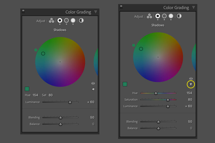
Click on the small triangle on the right to drop down the Hue and Saturation sliders.
Under each of the 3-Way color wheels, you’ll find a Luminance slider that controls the brightness of the color you’re introducing into your image.
100% black and 100% white cannot be given a color. For this reason, Lightroom’s Luminance slider can be used to change these 100% blacks and whites. Here’s how it works.
Under the Shadows color grading wheel, dragging the Luminance slider to the right will raise the black point so that blacks become slightly lighter and therefore absorb more of the color that you’re introducing with your grading.
Dragging it to the left lowers the black point, reducing the amount of color that you’re introducing to the darkest parts of your image.
There’s a similar effect on the Luminance slider for the Highlights: dragging it to the left will reduce your white point, making any whites less white and therefore capable of taking on your color grade. Dragging it to the right will do the opposite.
Pro tip: When viewing the individual wheels for Shadows, Highlights, and Midtones, you’ll find a disclosure triangle that expands to show the Hue slider and Saturation slider alongside Luminance, giving you even more means of tuning in your settings. When you drag these sliders, you’ll see the handles move on the wheel.
Blending and Balance
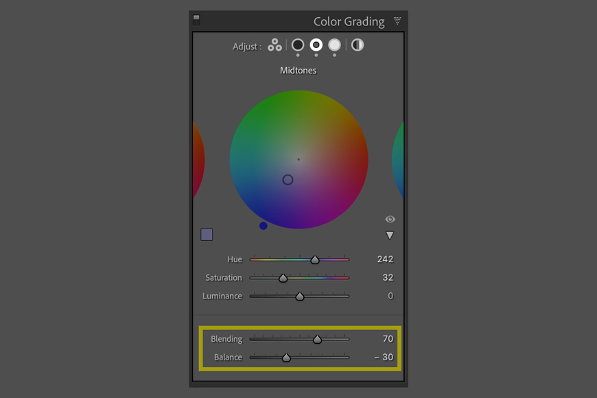
Blending and Balance are universal across the various split toning wheels, regardless of whether you’re looking at 3-Way, Shadows, etc. These determine how the Shadows, Midtones, and Highlights interact with one another.
Blending determines how much the colors overlap between the Shadows, Midtones, and Highlights. Set at 100, all three regions will spill over into each other, creating very smooth transitions.
Dragging the Balance slider to the left tells Lightroom to treat more of the image as shadows, while dragging it to the right treats more of the image as highlights.
Pro tip: Holding down Alt (Windows) or Option (macOS) while dragging the Balance slider will temporarily boost the saturation of each color to 100 so that you have a clearer idea of how your image is changing.
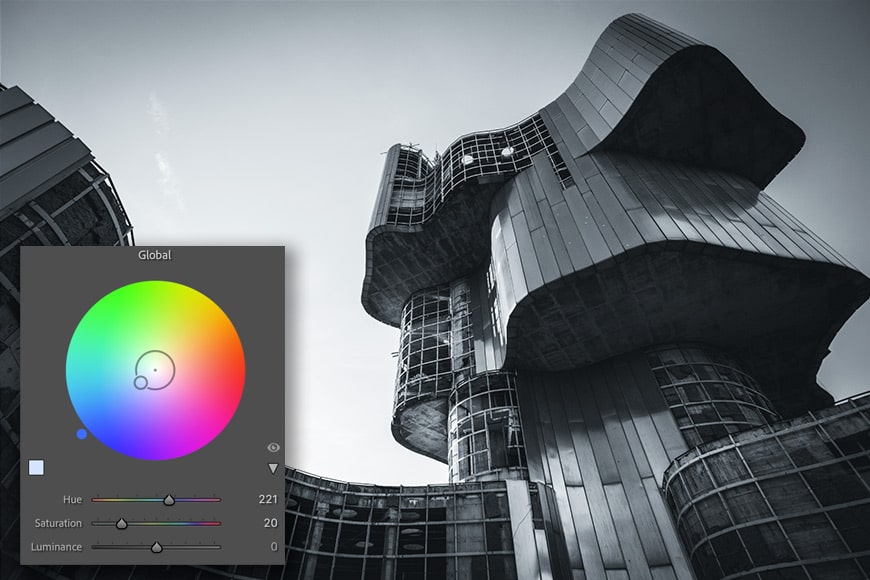
Global
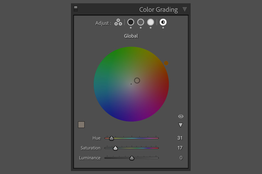
In addition to split toning options for Shadows, Highlights, and Midtones, Lightroom also gives you the option to apply a color globally.
This is not too dissimilar from setting Shadows, Highlights, and Midtones all to the same color.
5 Key Split Toning Tips Before Starting
1. Keep it simple

Split toning/color grading can be a clumsy tool and given the complexity of how all of the hues and saturations can overlap, it’s often best to keep things simple.
Fortunately, the best color grades are typically just that: simple and effective, and not overbearing. Sometimes, a hint of color in the highlights is all that’s needed.
For now, forget about the Luminance, Blending, and Balance sliders. Set up some colors that work well together (it helps to brush up on your color theory – more on that below) and then start playing with all of the other sliders.
If you do want to create something more complex, start off with a touch of color Shadows, and then try adding something to the Highlights. Once you’re happy with the balance, consider tweaking the Midtones.
2. Be subtle!
Adding a color grade requires a gentle touch and it’s worth remembering that your split toning should complement your image rather than dominate it.
Sometimes it’s best to apply a color grade and then step away from editing the image so that you can come back to it later with fresh eyes.
And remember: if the first thing that a viewer sees is your editing, you’ve pushed it too far!
3. Learn some color theory
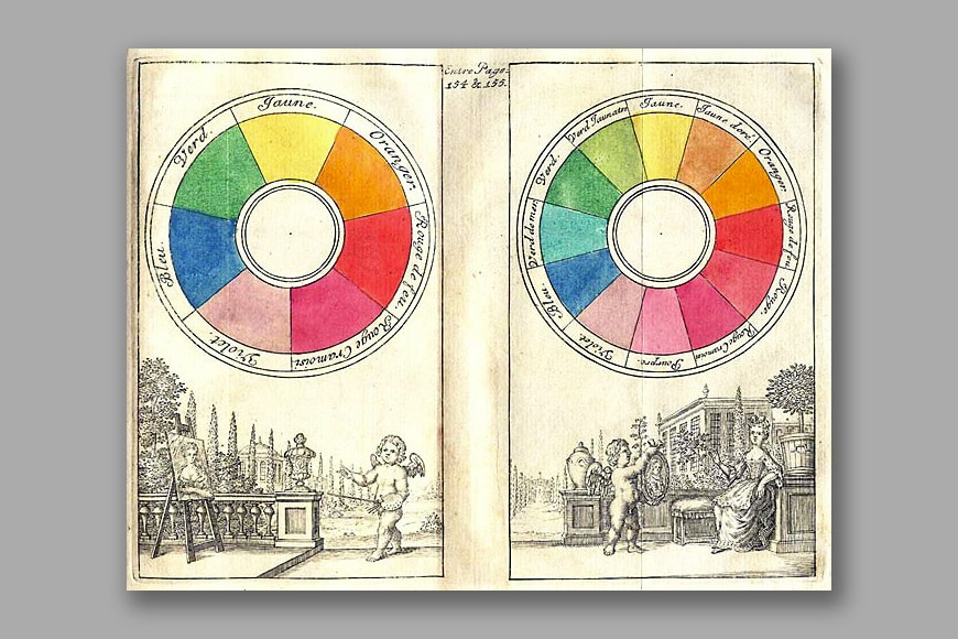
A Boutet color circle from 1708.
If you plan on adding more than one color to an image, you may want to learn how certain colors work well together (also known as “color theory”).
Opposite sides of the color wheel are considered complementary colors and these are a popular choice, as evidenced by the “orange and teal” look that’s seen so often on Instagram (see below).
Analogous colors — i.e., colors that are adjacent on the color wheel — can also be effective. Golden hour sunshine can be enhanced with red in shadows and orange in the highlights.
4. Try orange and teal
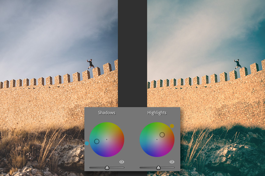
It’s something of a cliche but there’s a reason that it’s so popular! Adding teal to your shadows and orange to your highlights will give your images a cinematic feel that for some reason works really well on social media.
The effect tends to work best in sunny situations with blue sky and/or the ocean.
The orange can make people look healthy and tanned, though it’s easy to push it too far and give the impression that they’ve had an accident at a tanning salon!
Since that’s probably not the look you’re going for, keep it to subtle changes with highlights and shadows, and don’t mess too much with white balance.
You can download see our guide to editing portraits using Lightroom for more tips. or download a set of free Adobe Lighroom presets here to have a play around with this look.
5. Add mood to black and white photographs
Color grading isn’t just about color photographs; it’s also great for bringing an extra layer of mood or drama to a black and white photo.
This is similar to the sepia tone seen in traditional black and white printing, traditionally used to “fix” a print and help prevent it from fading over time.
You can add blue to an image to make it feel cold and impersonal, or perhaps try some red or orange to give it some warmth, which can be a nice look for vintage photography.
You can split-tone a black and white image using the highlights and shadows, or apply Global toning.
How to use Split Toning in Lightroom
Split toning and color grading can feel a bit chaotic and unpredictable when you first start experimenting. These tips will help you get started.
1. Finish all of your other editing first

Color grading should be the last part of your creative process when editing a photograph, allowing you to bring an extra layer of refinement and give your image a finishing touch.
As such, you should do all your other edits – including exposure, white balance, etc – before you think about adding any split toning.
If you’re not sure which direction to take your photograph, remember that you can create multiple Virtual Copies so that you can compare different color grades side by side.
2. Choose your hue and saturation for your Shadows and Highlights

In the Color Grading panel, set a hue and saturation for your shadows and your highlights by using each wheel as a color picker.
If you need more control, switch from the 3-Way view to one of the larger color wheels specific to Shadows, Highlights, etc.
Once these are set, add your Midtones and/or Global colors.
3. Set the Blending, Balance, and Luminance

Having chosen your hues and saturation, now experiment with the Blending and Balance. You can also go back to the specific color wheels and adjust the luminance.
How do I use Split Toning in Lightroom CC?
If you’re using the mobile Adobe Lightroom app, you can also take advantage of split tone features.
- Open up Lightroom CC’s Edit section (press E)
- Expand “Color” and scroll down to Color Grading
- From here, drag the handles in the center of each wheel to set your Hue and Saturation
- Use the slider underneath each wheel to set the Luminance
- Once you’ve dialled in your colors, set the Balance and Blending levels to perfect your split toning look
Final Words
There are various methods for stylizing your images through the addition of tones in the shadows, midtones, and highlights, but Adobe Lightroom’s Color Grading panel makes the process very easy once you know how the various color wheels and sliders interact with one another.
Color grading or split toning can give your photographs a style that’s distinctive to you – so why not have a play and see what results you can achieve?
If you’re still confused about how split toning works or have any questions, feel free to post a comment below. Good luck!


Andy Day is a British photographer and writing, living and working in France, specialising in adventure, travel, architectural and landscape photography.

WELCOME TO SHOTKIT
Enter your email to be sent
today's Welcome Gift:
19 Photography Tools
🔥 Popular NOW:


Shotkit may earn a commission on affiliate links. Learn more.